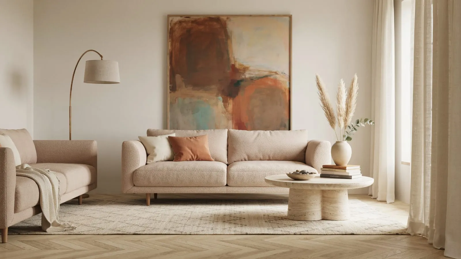
7 Ultimate Living Room Wall Art Ideas: How to Choose, Arrange, and Style Art That Works
Blank walls have a way of making even a beautifully furnished living room feel unfinished. You can have the right sofa, the right rug, the right lighting, and the room will still feel flat if the walls have nothing on them. Wall art is what turns a furnished space into a finished one, and it’s often the last thing homeowners tackle because it’s also the most intimidating.
This guide walks through everything that goes into choosing living room wall art that actually fits your space: sizing, placement, style matching, budget options, and the mistakes that trip up even experienced decorators. Whether you’re filling your first apartment wall or refreshing a living room you’ve lived in for a decade, you’ll find practical, tested advice here rather than vague inspiration.
Why Wall Art Matters More Than People Think
Wall art isn’t decoration in the purely cosmetic sense. It does real work in a room. It sets a focal point, so the eye has somewhere to land when you walk in. It adds color and texture that furniture and paint alone can’t provide. And it communicates personality faster than almost any other design choice, since art is one of the few elements in a home that’s genuinely personal rather than purchased off a showroom floor.
Interior designers often say a room isn’t complete until something is on the walls, and there’s a practical reason for that beyond aesthetics. Empty walls create visual imbalance. A large sofa against a bare wall reads as heavy on the bottom and empty on top, which makes the whole room feel off-kilter even if you can’t quite name why. Art corrects that imbalance by distributing visual weight from floor to ceiling.
Understanding Your Living Room’s Search for Purpose
Before buying anything, it helps to figure out what job you actually need the art to do. Not every wall needs the same kind of piece.
A statement wall needs one bold, large-scale piece that anchors the room and doesn’t compete with anything else nearby.
A gallery wall works well over furniture that’s already visually busy, like a patterned sofa, because a curated cluster of smaller pieces reads as intentional rather than cluttered.
A quiet accent piece suits a hallway leading into the living room or a narrow stretch of wall between windows, where you want a moment of interest without demanding attention.
Knowing which category you’re filling saves you from buying art that’s technically nice but wrong for the spot.
How to Choose the Right Size Wall Art
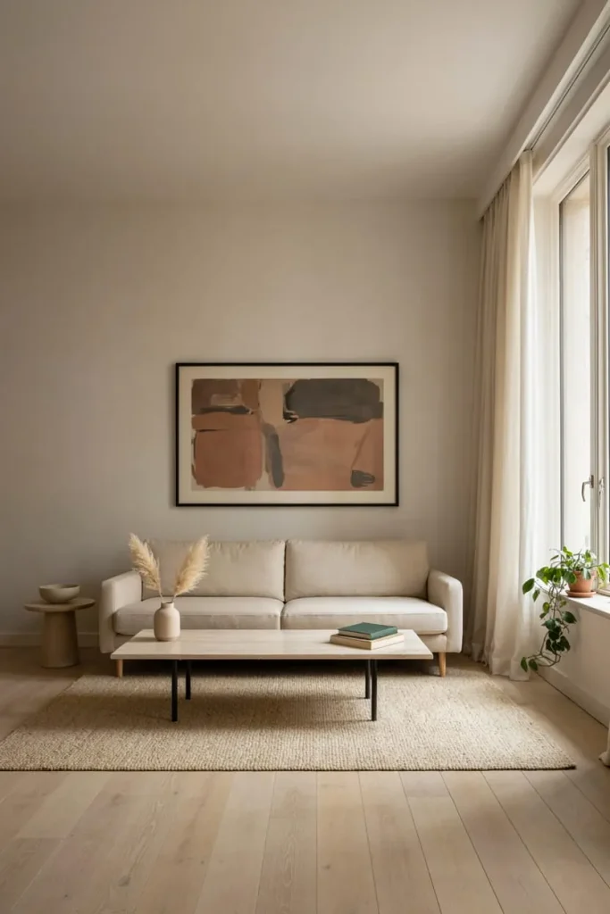
Undersized art is the single most common living room mistake, and it happens because people shop for art the way they shop for a picture frame instead of thinking about the wall as a whole. A piece that looks reasonably large on a store website often looks like a postage stamp once it’s on a ten-foot wall.
The Two-Thirds Rule
A widely used guideline among designers is to size art at roughly 60 to 75 percent of the width of the furniture it hangs above. So if your sofa is 84 inches wide, look for a piece (or a grouped arrangement) that spans somewhere between 50 and 63 inches. This keeps the art visually connected to the furniture instead of floating awkwardly above it.
Measuring Before You Shop
Before browsing, measure the actual wall space you’re working with, not just the furniture below it. Note the width, the height from the top of the furniture to the ceiling or crown molding, and any obstructions like light switches, outlets, or vents. Painter’s tape is genuinely useful here. Tape out the dimensions of a potential piece directly on the wall, live with it for a day or two, and you’ll get a far better sense of scale than any online mockup provides.
When to Go Big
If you’re torn between two sizes, size up. Oversized art almost always reads as intentional and confident, while undersized art tends to read as an afterthought. A single large piece also tends to be cheaper per square foot of visual impact than trying to fill the same space with several smaller ones.
Wall Art Placement and Hanging Height
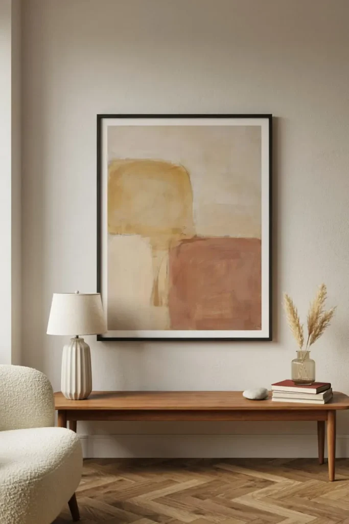
Placement is where a lot of otherwise good art purchases go wrong. The standard rule museums and designers use is to hang the center of the artwork at 57 to 60 inches from the floor, which approximates average eye level. That number is a starting point, not a rigid law.
Adjusting for Furniture
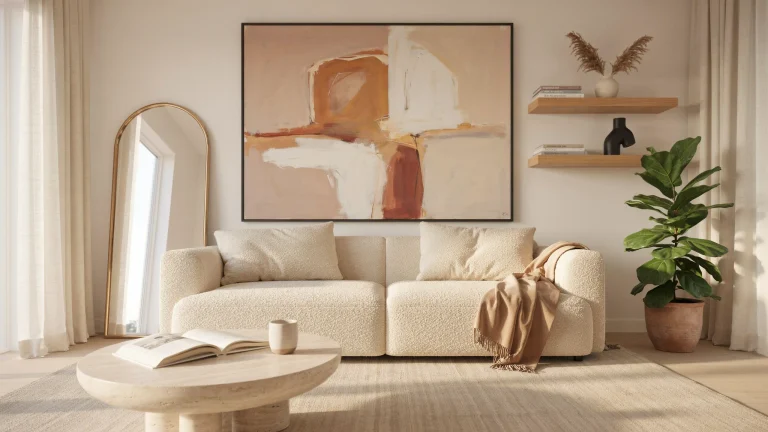
When art hangs above a sofa, console table, or credenza, the standard eye-level rule gets modified. In that case, leave 6 to 8 inches of space between the top of the furniture and the bottom edge of the frame. This keeps the art visually tethered to the piece below it rather than looking like it drifted upward on its own.
Common Height Mistakes
Hanging art too high is by far the more frequent error, and it usually happens because people unconsciously hang pieces relative to the ceiling rather than relative to eye level or the furniture below. The second most common mistake is spacing multiple pieces too far apart, which breaks the visual connection between them and makes a grouping look like unrelated leftovers rather than a curated collection.
Choosing a Style That Fits Your Living Room
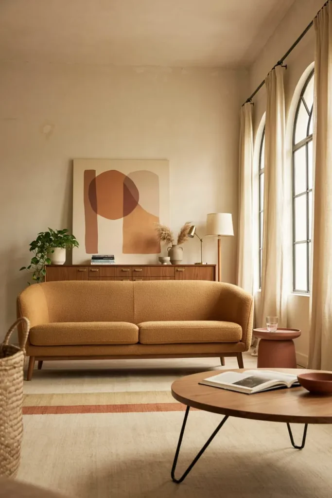
Art should feel like it belongs in the room, which means considering the existing design language before falling for a piece purely because you like it in isolation. That doesn’t mean matching your sofa fabric to your canvas print. It means paying attention to mood, color temperature, and line quality.
| Living Room Style | Wall Art That Works Well | What to Avoid |
| Modern minimalist | Abstract shapes, black-and-white photography, single-color line art | Ornate gilded frames, busy florals |
| Traditional | Landscape oil paintings, botanical prints, classic portraiture | Neon colors, overly abstract shapes |
| Mid-century modern | Geometric prints, atomic-era graphics, warm-toned abstracts | Rustic farmhouse signage |
| Farmhouse | Vintage-inspired prints, nature photography, distressed wood signs | Glossy metallic frames, sleek acrylic |
| Bohemian | Layered textiles, macramé, eclectic gallery walls, global-inspired prints | Single stark minimalist pieces |
| Coastal | Watercolor seascapes, botanical prints in blue and white tones | Heavy dark frames, saturated warm palettes |
Color temperature matters as much as subject matter. A room with warm wood tones and beige textiles generally pairs better with art that has some warmth in its palette, even if the subject is abstract. A room built around cool grays and crisp whites tends to handle high-contrast black-and-white or cool-toned pieces more gracefully.
Types of Wall Art for Living Rooms
Original Paintings and Fine Art Prints
Original paintings carry the most weight in terms of perceived value and personality, but they also carry the widest price range, from a few hundred dollars for an emerging local artist to tens of thousands for established names. Fine art prints, meaning limited-edition or numbered reproductions, offer a middle ground: real artistic pedigree at a fraction of the cost of an original.
Photography
Black-and-white photography remains one of the most versatile wall art categories because it pairs with nearly any color scheme in the room. Large-scale nature or architectural photography also works particularly well in rooms with high ceilings, since the scale of the image can match the scale of the wall without overwhelming it.
Tapestries and Textile Art
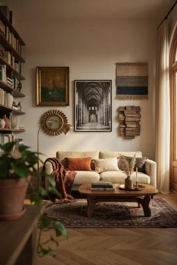
Textile pieces add warmth and softness that flat prints can’t replicate, and they also help absorb sound in rooms with hard flooring, which is a practical bonus beyond the visual one. Woven wall hangings work especially well in bohemian and eclectic spaces.
Mirrors as Wall Art
A large decorative mirror does double duty: it functions as art while also bouncing light around the room and making the space feel larger, which is particularly valuable in smaller apartment living rooms with limited natural light.
Sculptural and Dimensional Pieces
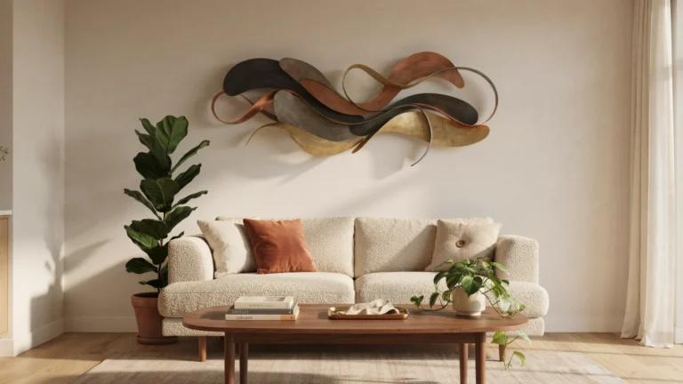
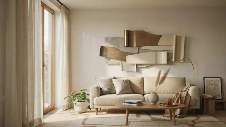
Wood carvings, metal wall sculptures, and dimensional wall hangings add texture that flat art can’t. They work best as a single statement piece rather than in a grouping, since their visual weight is usually too heavy to share space comfortably.
Wallpaper Panels and Murals
Removable wallpaper murals have become a popular renter-friendly way to create a feature wall without committing to paint or permanent wallpaper. They’re a good option for anyone who wants drama on one wall without the long-term commitment.
Gallery Walls: How to Do Them Right
Gallery walls are one of the more forgiving ways to fill a large wall, but only when they’re planned with some intention.
Planning the Layout
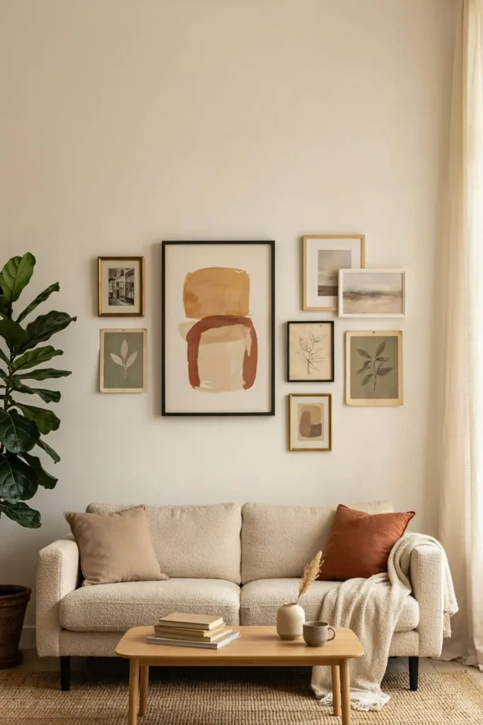
Lay the pieces out on the floor first in the arrangement you’re considering, then trace the layout onto kraft paper and tape the paper templates directly to the wall. This lets you adjust the spacing before putting a single nail hole in the drywall, which matters more than it sounds like it should once you’re three frames in and realize the spacing is uneven.
Spacing Guidelines
Keep 2 to 3 inches between frames for a cohesive but not cramped look. Anything tighter starts to feel chaotic; anything looser starts to feel like the pieces aren’t actually related to each other.
Mixing Frame Styles
A gallery wall doesn’t require matching frames, but it usually benefits from a unifying element, whether that’s a consistent color palette across the frames, a shared finish like all black or all natural wood, or a common subject matter that ties the collection together conceptually even when the frames themselves vary.
Common Gallery Wall Mistakes
The biggest mistake is treating every piece as equal in size and importance, which creates a flat, monotonous grid instead of a dynamic composition. A stronger approach anchors the arrangement with one larger piece and builds smaller pieces around it, similar to how a strong headline anchors a page of text.
Budget-Friendly Wall Art Ideas
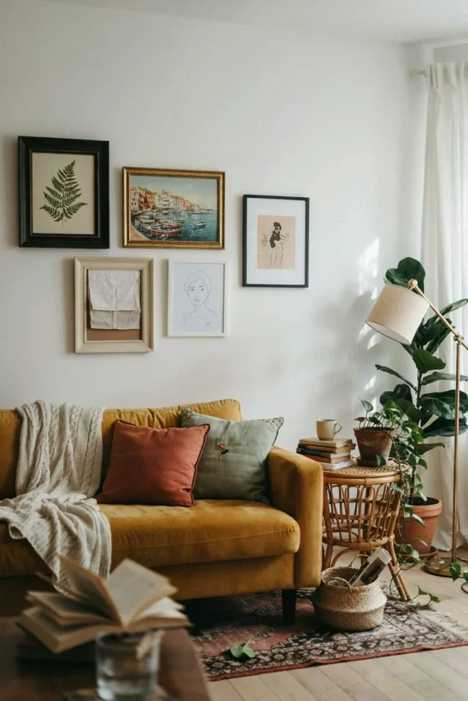
Good wall art doesn’t require a large budget, and some of the most compelling living rooms are built on resourcefulness rather than spending.
- Frame textiles or wallpaper samples. A striking fabric remnant or wallpaper sample, framed simply, can look every bit as intentional as an expensive print.
- Shop print marketplaces. Sites that sell digital downloads of artwork let you print at a local shop for a fraction of gallery pricing, and you control the exact size.
- Rotate seasonal art. Inexpensive frames with interchangeable inserts let you swap art with the seasons without buying new frames each time.
- Use what you already have. Vintage postcards, botanical illustrations from an old book, or a child’s artwork, matted and framed well, often look far more sophisticated than their cost suggests.
- Thrift and estate sales. Older frames with real character are frequently available secondhand for a fraction of retail cost, and a fresh coat of paint can update a dated frame in an afternoon.
Renter-Friendly Wall Art Solutions
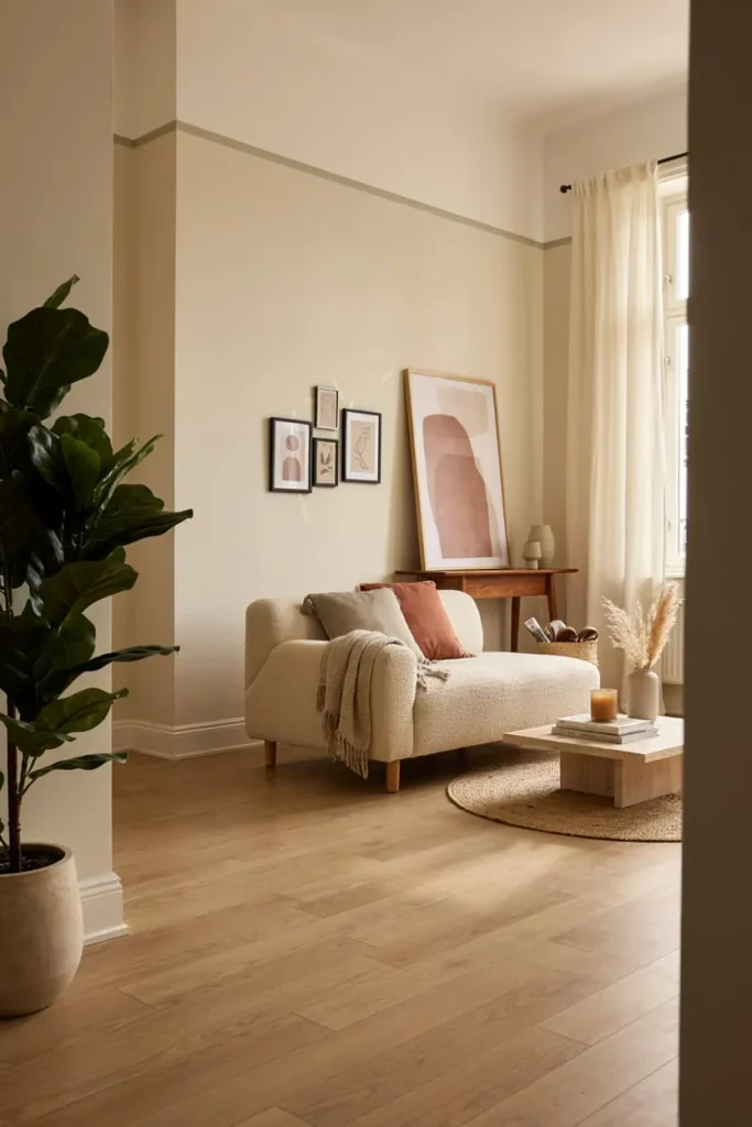
Renters face a specific set of constraints, since most leases restrict or prohibit permanent wall damage. Fortunately, the market for damage-free hanging has expanded considerably.
Command strips rated for the specific weight of your piece are reliable for lightweight to medium art, generally up to about 16 pounds per large strip set, though always check the packaging for the exact rating. For heavier pieces, a leaning arrangement, where oversized art rests against the wall on the floor or on a console table rather than hanging, sidesteps the hanging question entirely and has become a popular styling choice in its own right, not just a workaround.
Removable wallpaper and adhesive wall decals offer another route to a feature wall without violating a lease, and most residential-grade removable products are designed to come off cleanly without stripping paint, though it’s worth testing a small hidden area first.
Common Mistakes to Avoid
Buying art before measuring the wall. This is the single most reversible mistake, and it’s the easiest one to prevent. Measure first, always.
Matching art too literally to the sofa. Art that’s chosen purely to match throw pillow colors tends to feel like it was picked by a formula rather than a person. Aim for a palette connection rather than an exact match.
Hanging everything at the same height. A room where every piece sits at the identical 58-inch mark, regardless of context, starts to feel rigid rather than intentional.
Ignoring the frame. The frame is not an afterthought. A cheap, flimsy frame can undercut an otherwise beautiful print, while a well-chosen frame can elevate an inexpensive poster into something that looks considered.
Overcrowding a small wall. Not every wall needs to be filled. Negative space around a piece of art gives it room to breathe and often reads as more sophisticated than a wall packed edge to edge.
Forgetting about lighting. Art hung in a dim corner without any supplemental light loses most of its visual impact after sundown, which is a significant portion of the time most people are actually in their living room.
Lighting Your Wall Art
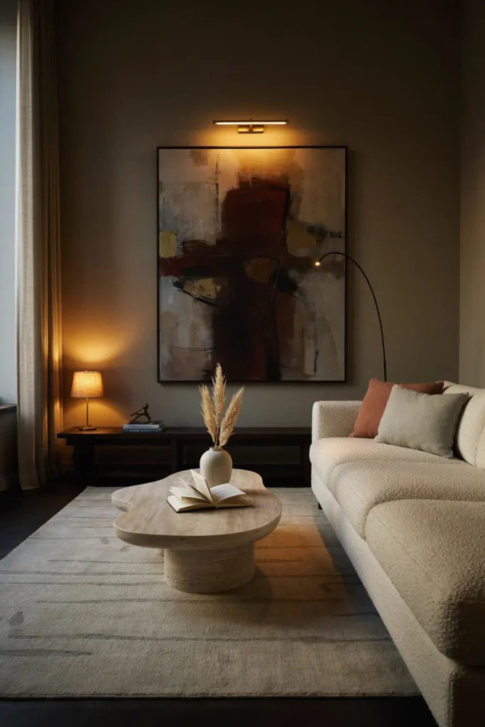
Lighting changes how art reads more than almost any other variable. A picture light mounted directly above a piece creates gallery-style illumination and works particularly well for a single statement painting. Track lighting or adjustable recessed cans aimed at a gallery wall give even coverage across multiple pieces without the cost of individual fixtures for each one. For renters who can’t add hardwired fixtures, plug-in picture lights and battery-operated LED strip lights tucked behind a frame’s edge are workable alternatives that require no electrical work at all.
Avoid placing valuable original art or photography in direct sunlight for extended periods, since UV exposure can fade colors and, in the case of photographs, cause visible yellowing over time. UV-filtering glass or acrylic in the frame helps if the piece has to hang on a sun-exposed wall.
Seasonal and Trend Considerations
Wall art trends shift, but the underlying principles of scale, placement, and personal relevance don’t. Recent years have seen a swing toward warmer, more textured pieces, hand-painted ceramics, and nature-inspired abstracts, moving away from the stark, oversized typography prints that were popular in the previous decade. Curved and organic frame shapes have also gained ground over strict rectangles.
That said, chasing trends for their own sake tends to produce a living room that feels dated the moment the trend passes. A more durable approach treats trends as a source of inspiration for smaller, swappable pieces, while investing more permanently in art that you’d still want on the wall in ten years regardless of what’s currently popular.
Maintenance and Care for Wall Art
Dust prints and canvases regularly with a soft, dry microfiber cloth, since dust buildup can dull colors over time and is far easier to prevent than to remove. Avoid glass cleaner directly on canvas or unframed paper. For framed pieces behind glass, spray the cleaner onto the cloth first rather than directly onto the glass, which prevents moisture from seeping behind the frame edge.
Check hanging hardware annually, particularly in homes with variable humidity, since wood frames can expand and contract seasonally in ways that loosen wire or hooks over time. If a piece has real monetary or sentimental value, consider having it professionally appraised and, where appropriate, insured under a homeowner’s or renter’s policy rider, since standard policies often cap fine art coverage well below replacement value.
Actionable Takeaways
- Measure the wall before you shop, not after.
- Size art to roughly 60 to 75 percent of the furniture width below it.
- Hang the center of a piece 57 to 60 inches from the floor, or 6 to 8 inches above furniture.
- Use kraft paper templates to plan gallery walls before hanging anything.
- Choose art for its color temperature and mood, not just its subject matter.
- Invest more in pieces with lasting appeal; treat trend-driven pieces as swappable accents.
- Light your art intentionally, especially in rooms used heavily after dark.
- Protect valuable pieces from direct sunlight and check hanging hardware annually.
Frequently Asked Questions
How high should I hang wall art in a living room? The center of the piece should generally sit 57 to 60 inches from the floor, which approximates eye level for most adults. Above furniture like a sofa, leave 6 to 8 inches between the top of the furniture and the bottom of the frame instead.
What size wall art should I get for a large living room wall? Aim for the art, or the full span of a grouped arrangement, to cover roughly 60 to 75 percent of the width of the furniture beneath it. For a bare wall with no furniture reference, oversized single pieces generally look more intentional than several small ones scattered across the space.
Is it okay to have no matching frames in a gallery wall? Yes, and mismatched frames often look more curated than a matching set, as long as there’s a unifying thread, whether that’s color, finish, or subject matter, tying the pieces together.
What wall art works best above a sofa? Horizontal pieces or a horizontally arranged gallery cluster tend to work best above a sofa, since the shape echoes the furniture’s own horizontal line. The art should span roughly two-thirds to three-quarters of the sofa’s width.
How do I hang heavy art without damaging rental walls? Weight-rated Command strips work well for lighter pieces, generally up to about 16 pounds per set depending on the product. For heavier art, leaning the piece against the wall on the floor or a console avoids hanging hardware altogether.
Should wall art match my furniture colors exactly? No. A close color match to your sofa or rug can look more like a formula than a design choice. A better approach is to connect the art to the room’s overall palette or mood without matching any single item precisely.
What’s the biggest mistake people make with living room wall art? Buying art that’s too small for the wall is the most common mistake, followed closely by hanging it too high. Both stem from not measuring the actual wall space before shopping.
Can mirrors count as wall art? Yes. Large decorative mirrors function as art while also reflecting light and making a room feel larger, which makes them a practical choice for smaller or dimly lit living rooms.
How much space should I leave between pieces in a gallery wall? Generally, 2 to 3 inches between frames keeps a grouping feeling cohesive without looking cramped or, at the other extreme, disconnected.
Do I need professional help to choose wall art for my living room? Not typically. A methodical approach, measuring the wall, understanding your room’s style, and testing placement with paper templates before committing, gets most homeowners a strong result without hiring a designer. Complex, large-scale gallery walls or art curated around valuable original pieces are the situations where professional input tends to pay off most.
Bringing It All Together
Wall art is one of the few design decisions in a living room that’s genuinely reversible and genuinely personal at the same time. Unlike a sofa or a rug, you can experiment, swap, rearrange, and course-correct without much cost or commitment, which makes it one of the lower-risk, higher-reward projects in the whole process of decorating a home.
Start with measurements, not inspiration photos. Figure out what job the wall actually needs done, whether that’s a bold anchor piece, a curated gallery, or a quiet accent. Then choose pieces that connect to your room’s color temperature and mood rather than chasing whatever’s trending this season. Get the height right, give the arrangement room to breathe, and light it so it still does its job after the sun goes down.
Do that consistently, and the walls stop being the unfinished part of the room and start being the reason people notice it in the first place.